Out of the shadows and into the light
With over 50,000 scientific publications every year, the CNRS is the world's leading producer of knowledge. This world-renowned research center is often known by name, but for ordinary people, its role often remains obscure. What's more, because of its many activities and areas of research, the brand is often diluted by disparate structures. Seenk was commissioned to increase its impact and recognition through a new brand architecture and visual identity.


And there was light.
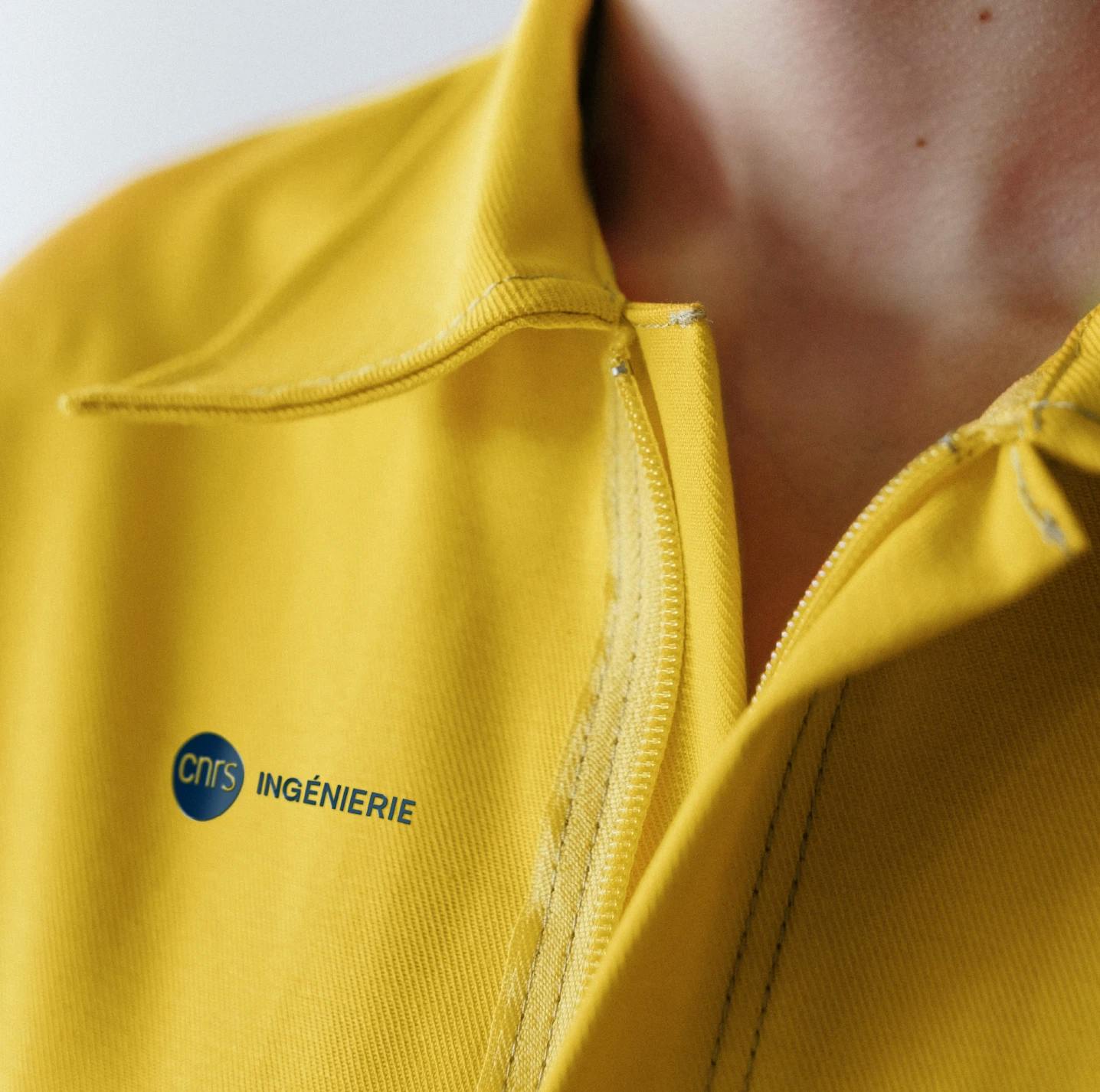
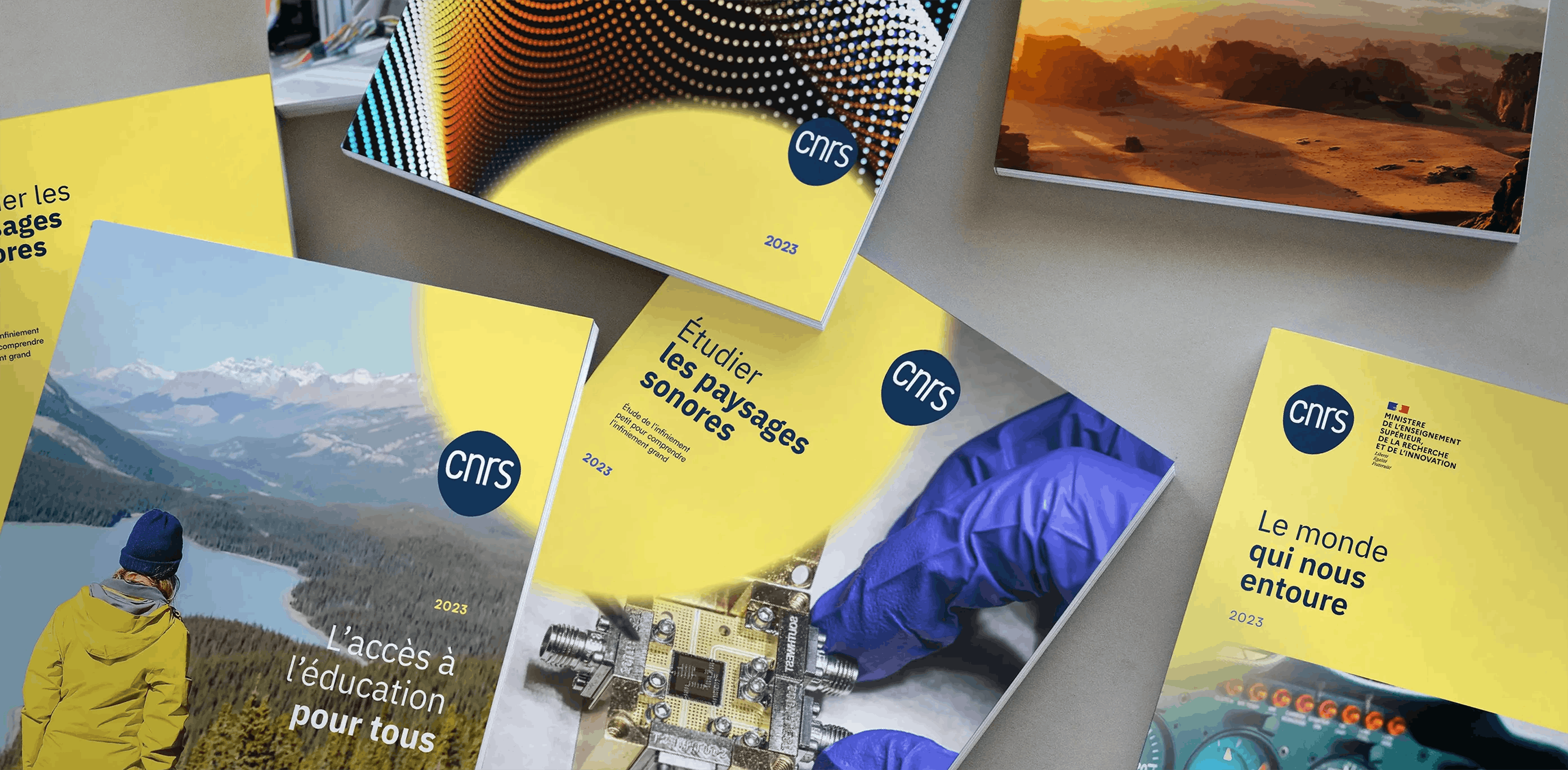
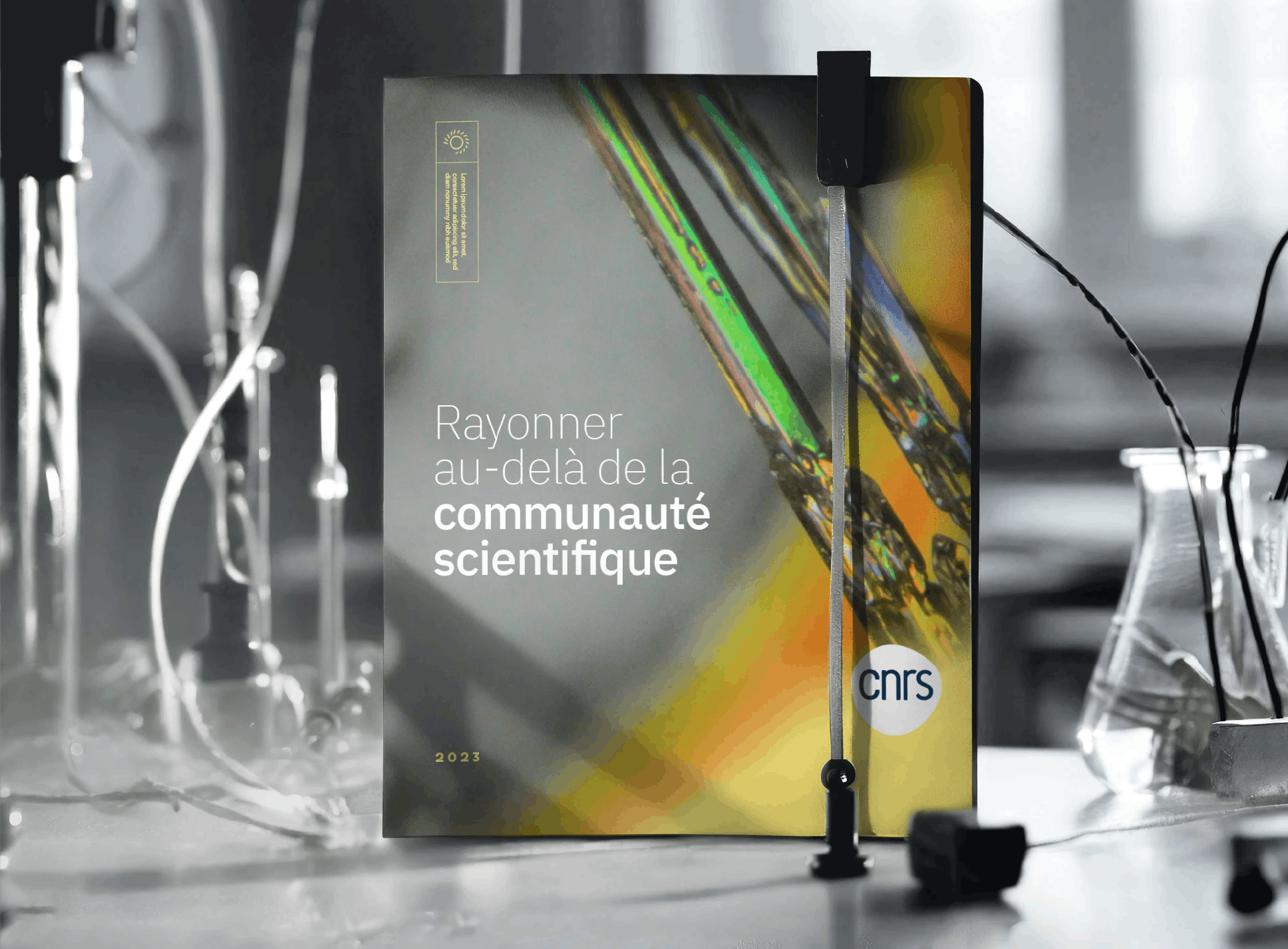
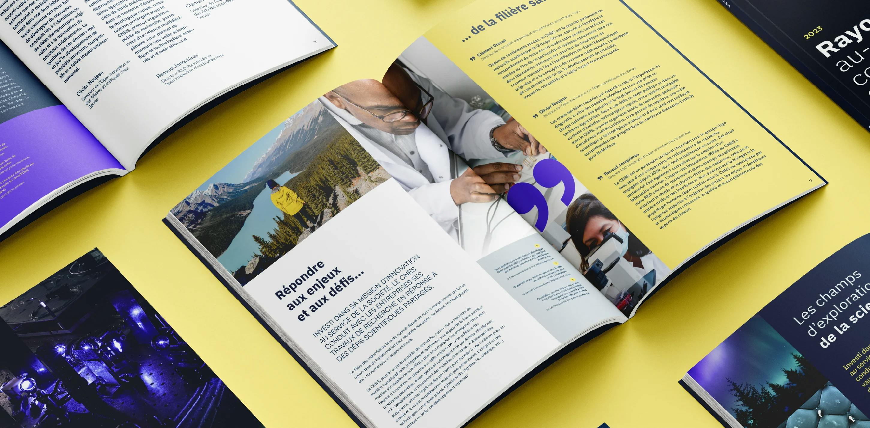
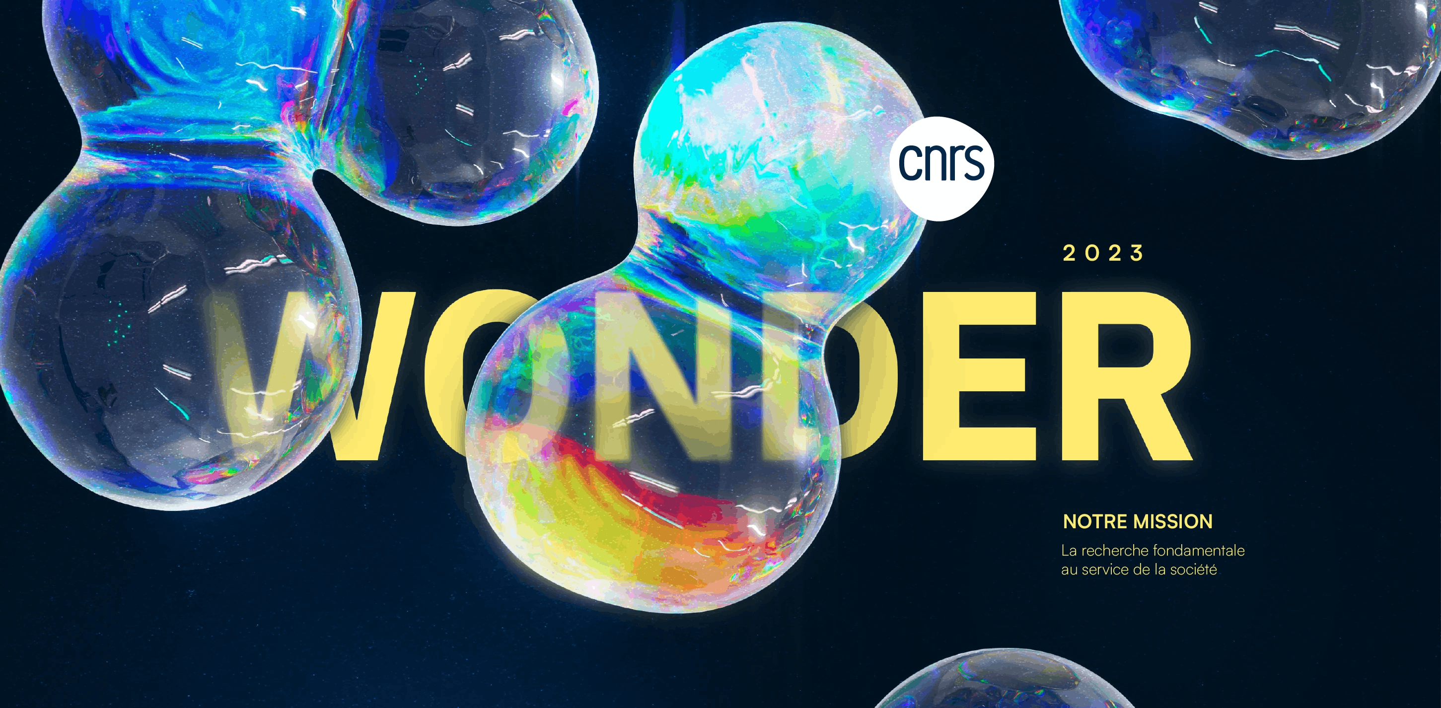
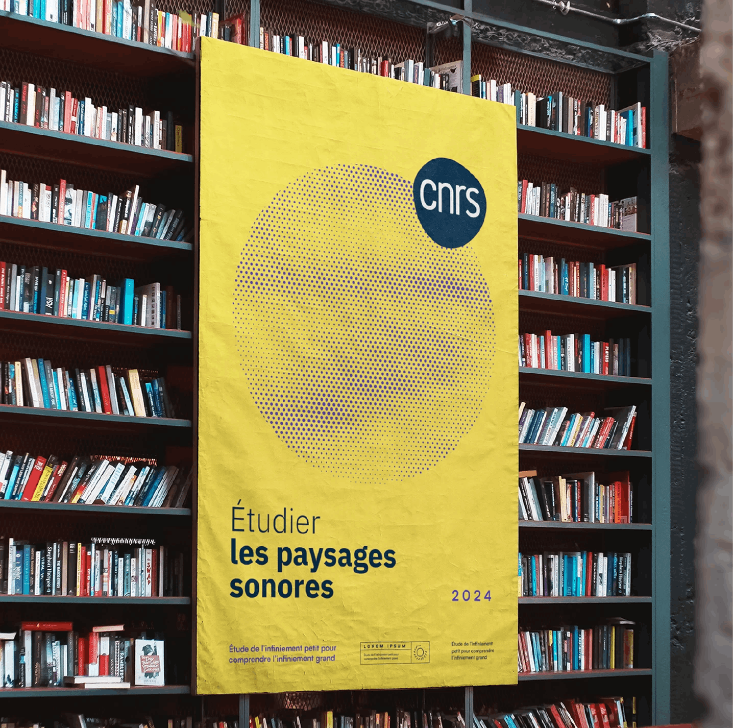
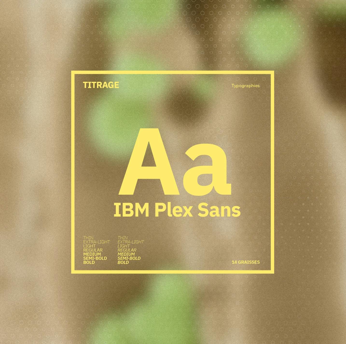
To make the CNRS immediately recognizable, we created a graphic system inspired by light. A symbol synonymous with knowledge, it also warms up the brand with a proprietary color that contrasts with the ubiquitous blue of the sciences.


A radiant brand.
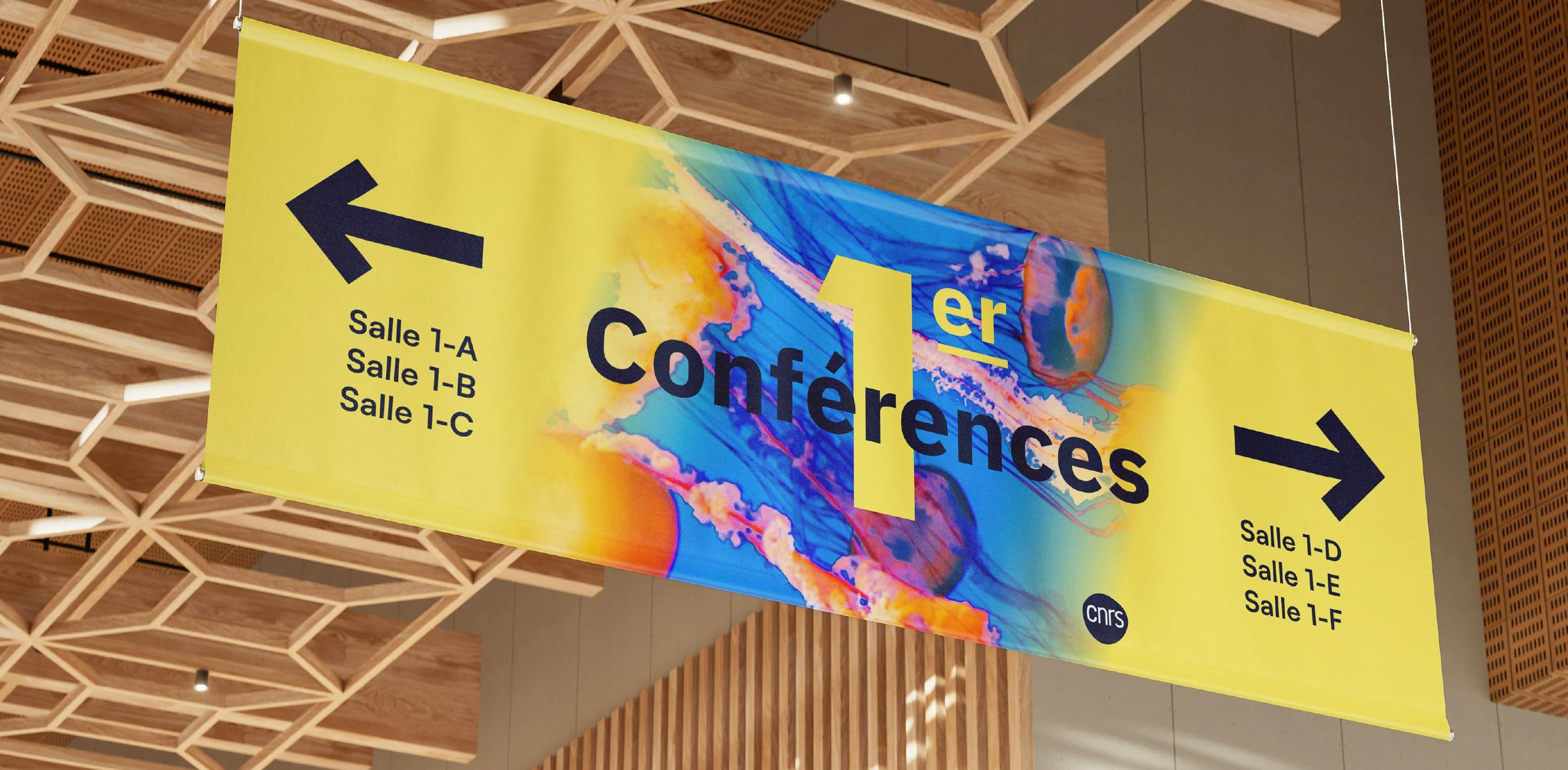
One of the challenges facing the CNRS was to "radiate beyond the scientific community". We took this challenge literally, creating a graphic system that highlights the CNRS and enables the brand to make a strong impression on the general public and on all its communication channels.


A common DNA
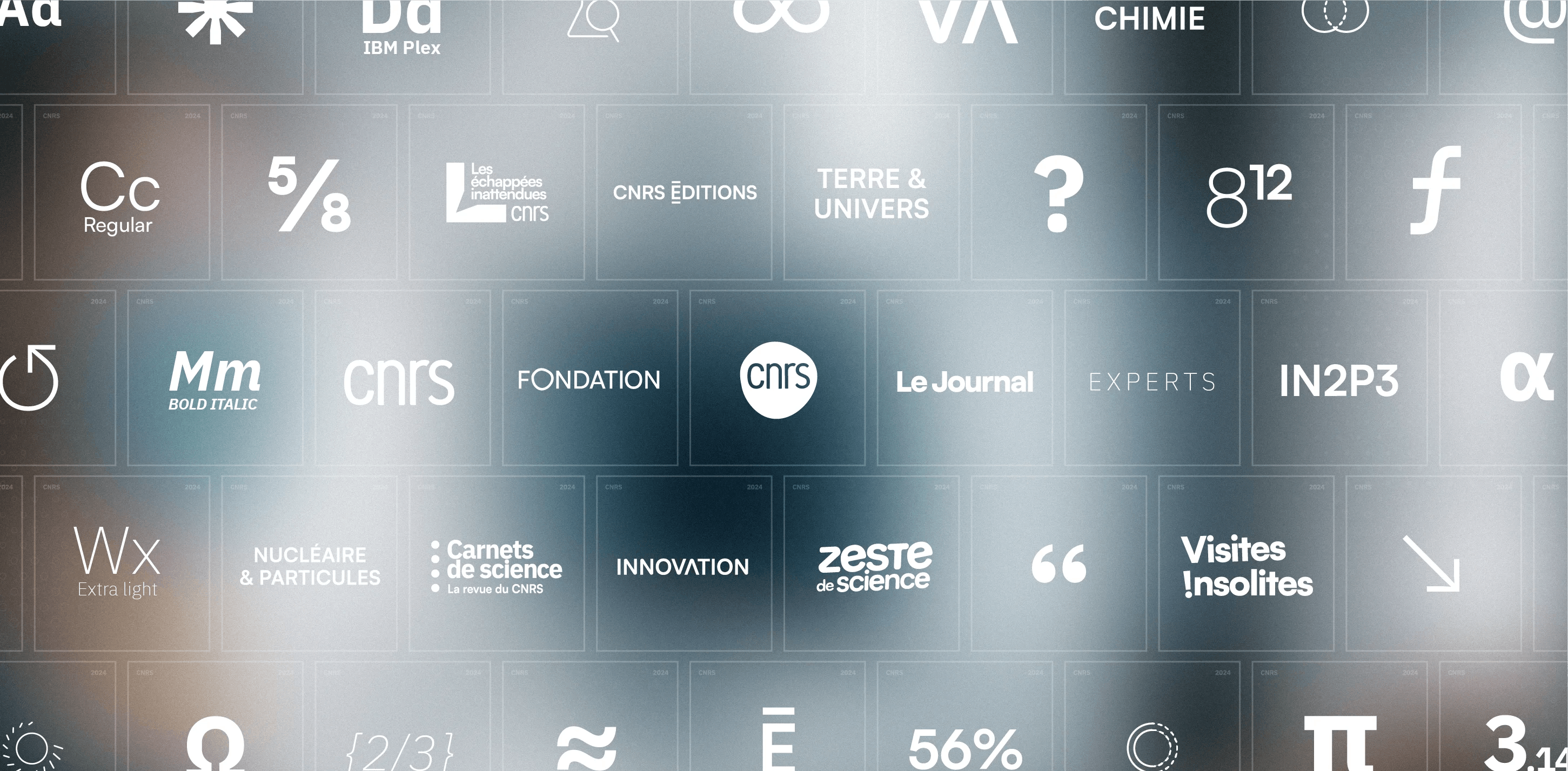
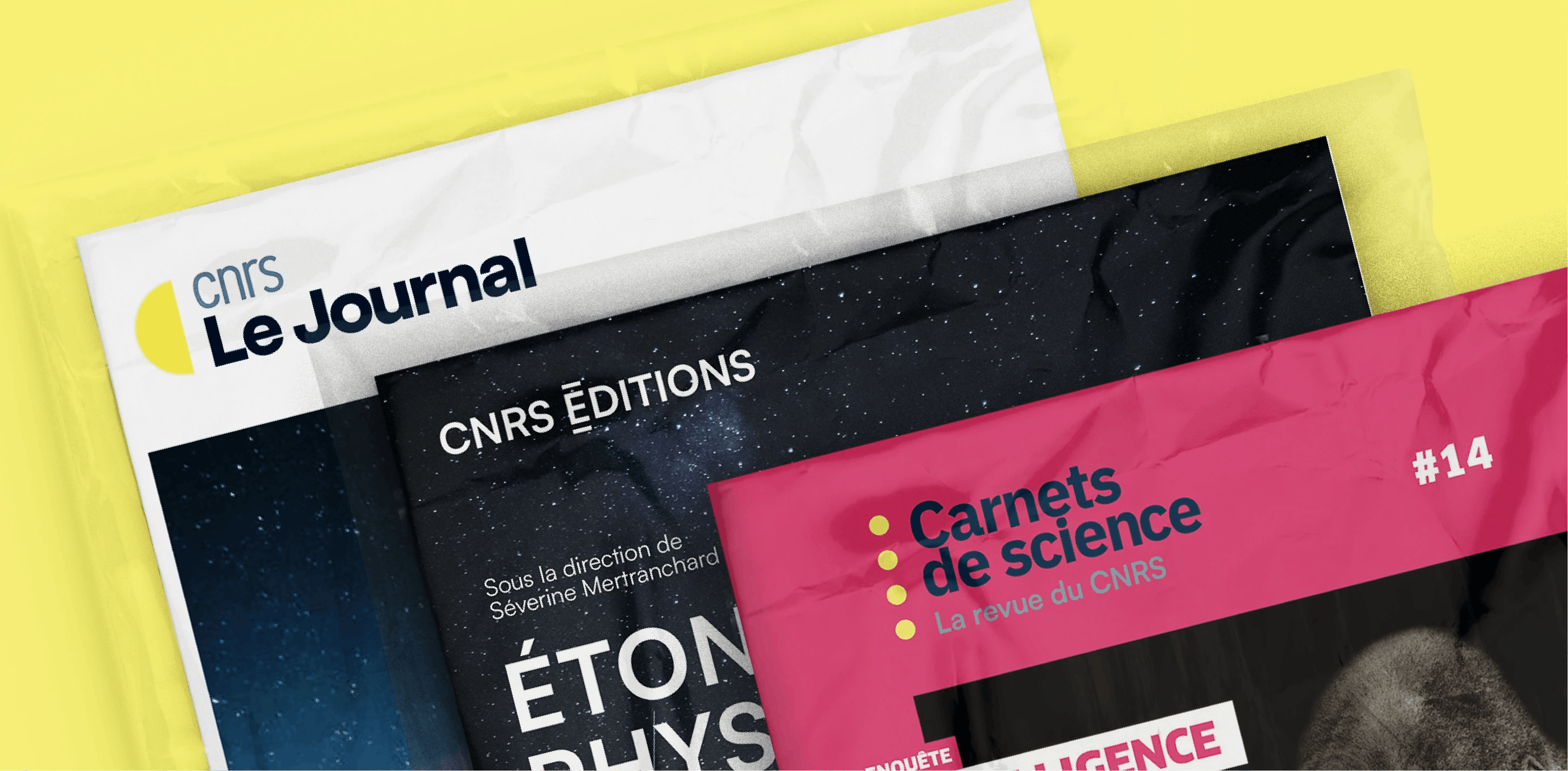
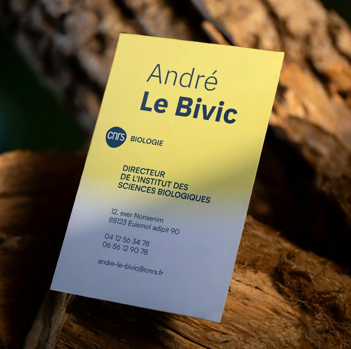
There is not one science, but many. The CNRS reflects this. From biology to the social sciences, it is the only organization with a presence in every scientific field. In addition, it has a wide range of other activities (foundation, mass media, publishing house...). Because of their different nature, we have preserved the identity of these structures while creating a common family air. We have also increased the presence of CNRS on the logos of the "institute brands".
